Meeting a challenge: Book explores innovations of modern Japanese home design
Challenged to build homes that create a feeling of light, space and tranquility in some of the world’s most densely populated areas, Japanese architects have had no choice but to think outside the box. Literally.
Basic elements like walls, windows and floors are reinvented to solve design conundrums, such as homes built on footprints the size of studio apartments or surrounded on all sides by other buildings. Frequently, the materials of choice are a combination of reinforced concrete, wood and glass.
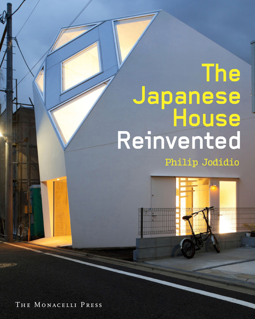
With interest in micro-housing growing worldwide, such innovations have made Japanese architecture a leading force in contemporary home design. A new book, “The Japanese House Reinvented” (Monacelli Press) by Philip Jodidio, surveys more than 50 contemporary homes, by both emerging and established firms.
“Faced with the constraints of very dense urban areas and a lifestyle that has long taken into account small spaces, Japanese architects and their clients have shown a surprising willingness to experiment,” writes Jodidio, who has written more than 100 books on contemporary architecture, including monographs on architects Tadao Ando and Shigeru Ban.
The elegant houses in the book seem almost miraculously livable and show a way forward for challenging architectural puzzles.
But they are not for the timid.
In a Yokohama house designed by Takeshi Hosaka Architects, the basement level of a 980-square-foot house features a hardwood floor that slopes sharply upward at one end toward the street-level window above, resembling a sleek sort of skateboard ramp. There is no defining line between floor and wall. The ceiling, in turn, slopes steeply upward, allowing for an enormous, almost story-high window.
The unusual design creates an urban basement with plenty of natural light and privacy all at the same time, and gives the diminutive two-story building the outward appearance of being three stories tall.
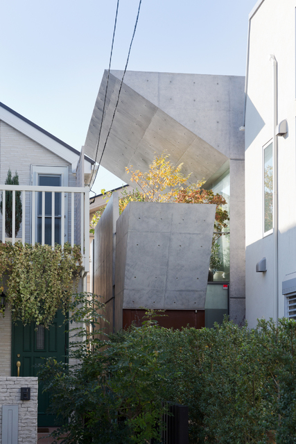
An even tinier home in Tokyo, this one designed by Koji Tsutsui and Associates, features powerfully angled “bent boxes” of reinforced concrete, which manage to hide views of neighboring houses while allowing in sunlight through a partially sheltered balcony. There’s space on the balcony for a few plants and small trees.
“For a house this small, surrounded on all four sides, we had be really creative about light, and the space had to be very multi-purpose,” said Satoshi Ohkami, an associate at the firm, adding that many Japanese design solutions could be applied elsewhere in the world.
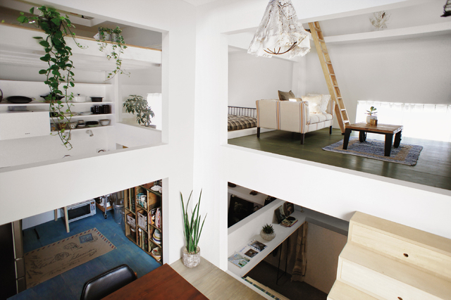
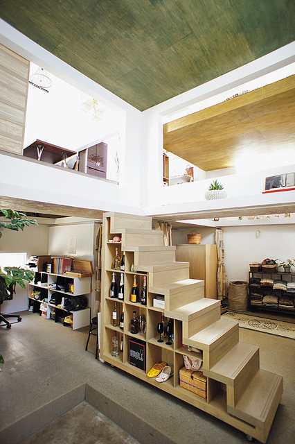
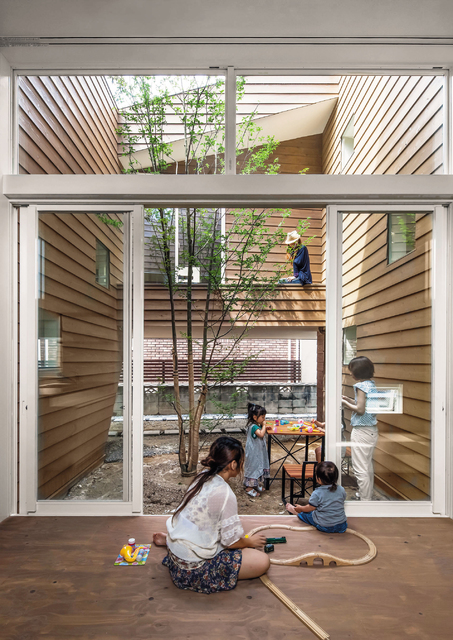
In a similarly small Tokyo house by Hiroyuki Shinozaki Architects, a movable staircase separated from the structure allows for different shelf-like floor levels at irregular heights, and rooms that can be easily reconfigured for changing needs.
Not all the houses are diminutive, however.
Like many Americans, Japanese tend to prefer houses over apartments, and roughly 60 percent of Japanese dwellings are single-family homes, Jodidio writes. Many of them are in dense urban areas.
See-through flooring, reflective ceilings, plentiful balconies, mezzanines and inner courtyards, and windows and walls at surprising angles are more the rule than the exception among homes by these Japanese architects. Windows come in all shapes and sizes, frequently appearing at unexpected angles. And light-drenched inner courtyards are juxtaposed by frequently closed-looking exteriors, some of which even conceal entries.
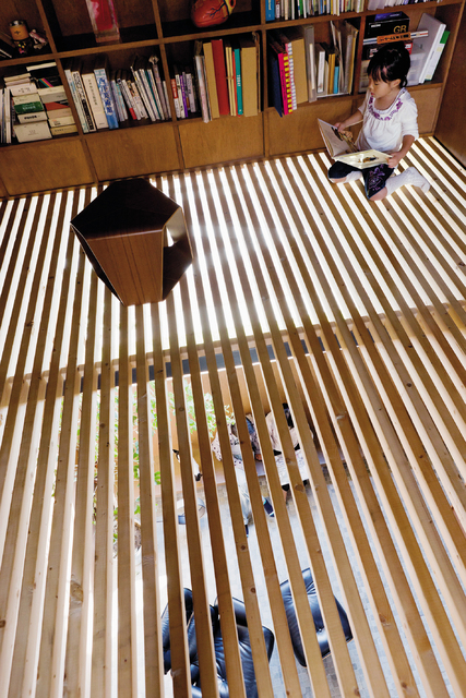
The architect Go Hasegawa designed one Tokyo house with a louvered floor, consisting of wood flooring with generous slivers of open space between the floorboards, giving the illusion of space and allowing sunlight from a big upper window to reach the ground floor.
“It is truly open. Air, sound, smell and the everyday life of the family come up and down through this louvered floor,” Hasegawa said.
“Now is the moment we can innovate the house and help create a new way of living. Not only architects, but I feel clients, also,” are engaged in that quest, he said.
Much as sliding, rice-paper screens traditionally made indoor areas more flexible in Japan, intermediate floor levels and inner open spaces add a feeling of space.
And the grandeur of nature is evident in simple yet dramatic touches, such as a single tree in a minuscule inner courtyard or balcony, or a sliver of visible sky at the top of a wall.
“We design minimalist and clean design to get rid of clutter,” said Ohkami, speaking from Mill Valley, California, where his firm has a studio (Tsutsui is currently a visiting professor at the University of California in Berkeley). “We focus on details and materials within the space to create the character, and the materials become very important. Concrete is a lot more common in Japan in the United States. People are hesitant here to use concrete. I don’t know why exactly. Architecture has to be flexible.”


